
Typography
Brand Fonts
Typefaces with accessibility and aging vision is top-of-mind for us. We are experts and thought leaders. Our written words are to be as trusted as they are read, and the aesthetic of the type should convey that.
Primary Typefaces
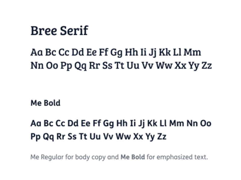
Our primary font set consists of 2 – We have chosen “Bree”, a slab-serif font, as our primary headline font to support a friendly and approachable tone with its uplifting curves and symmetric spacing. “Me” supports our smaller headings and body copy and is chosen for its level of accessibility for all levels of vision. Every letter of Me was tested for its appeal and readability with a range of learning disability and vision impaired groups.
Bree is available as a free google font. Me requires a license for usage and is currently limited to marketing product team.
Bree is available as a free google font. Me requires a license for usage and is currently limited to marketing product team.
Fallback typefaces
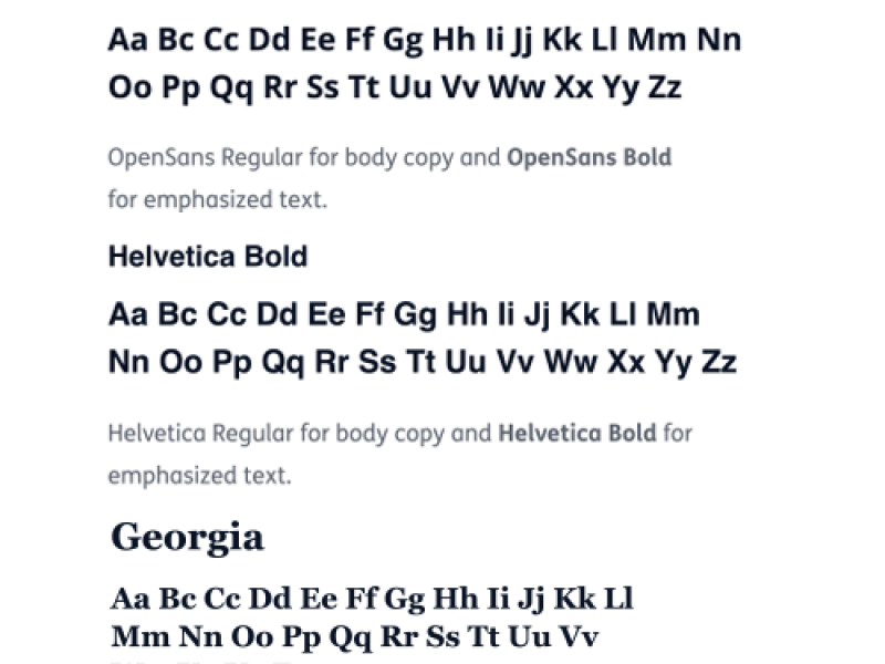
In those instances when our primary typefaces are unavailable or in the need for a web safe font, substitute Georgia for Bree and substitute OpenSans or Helvetica for Me. Be sure to use the same weights.
OpenSans is available as a free google font. Georgia and Helvetica are standard web safe fonts and are available on all systems.
OpenSans is available as a free google font. Georgia and Helvetica are standard web safe fonts and are available on all systems.
Typography Usage
To accommodate a variety of use cases, we created a flexible set of type settings that include ranges for use in digital and print.
Medicare & Medicaid: All fonts need to be equivalent to 12pt in Times New Roman or larger


Headline Styling
Headlines may be written as full sentences or fragments, depending on context. Whether sentences or fragments, take care to craft parallel treatment for parallel devices, such as headers across a three-column layout or equivalent subsections within a page.
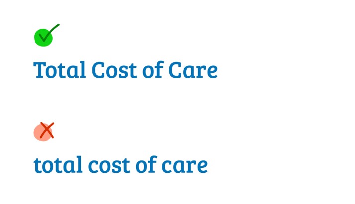
Fragments
- Fragments should be rendered in title case, with no period. Articles and short prepositions are not capitalized.
- Avoid long fragments. If long copy is needed, try to make it a sentence.
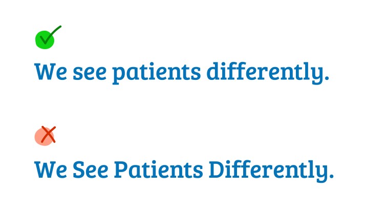
Sentences
- Full sentences should be rendered in sentence case, with a period.
- Note that sentences in which “you” is implied are still sentences.
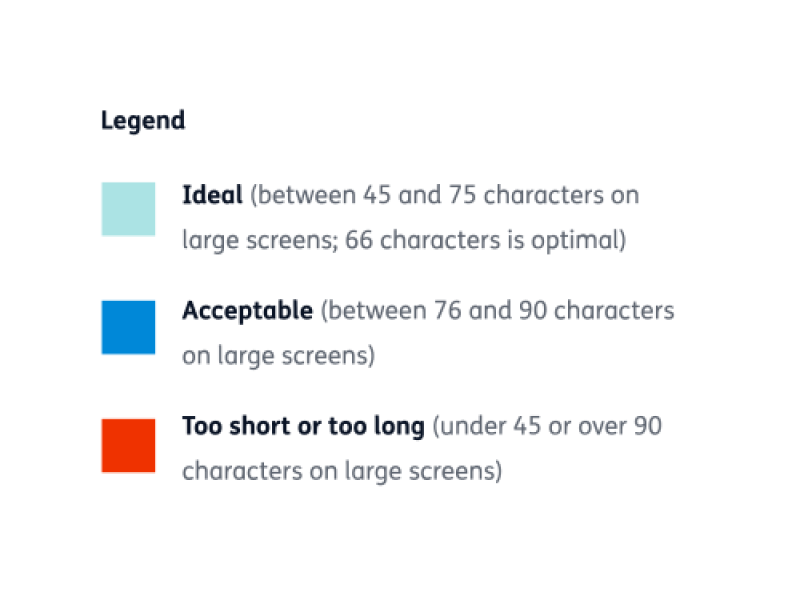
Line Lengths
The number of characters in a line of text affects its readability. Studies have shown that the optimum line length is 45-75 characters for larger screens and 35-40 characters for mobile screens. Our preferred line lengths are at the upper limit of these optimal ranges (75 and 40 characters, respectively). You may deviate slightly, but avoid going into the red zones.
