Photography
Introduction
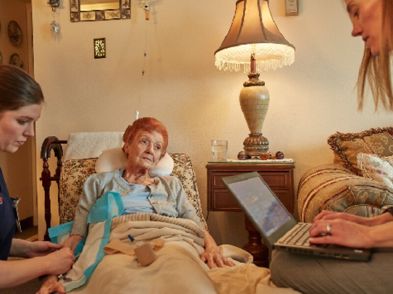
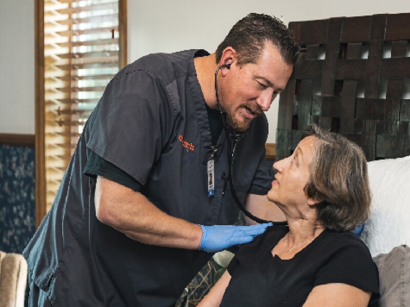
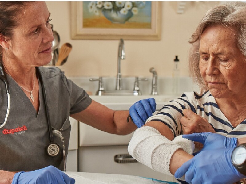
Photography is utilized broadly across our brand within most communication channels to relate more and connect us closer to our customers, elevating the patient experience with a focus of patient life. We utilize photography to add a human element, support narratives and tone, and allow the content to inspire and motivate.
Themes
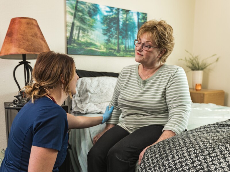
A shift from past graphic illustration, we use a more photo-driven approach which showcases intimate and celebratory scenes of our patients — from the decisions being made around health and well-being to the care being provided in the home. We take care to represent our patients, providers, and the treatment being received as aspirational, non-intimidating, and easy to process, heightening the benchmark in our industry and elevating our visual narrative.
We strive to focus on an optimistic outcome in any care situation. We strive to represent a culturally diverse audience and, where appropriate, a multi-generational audience to relate to our demographic and key domestic decision makers.
We strive to focus on an optimistic outcome in any care situation. We strive to represent a culturally diverse audience and, where appropriate, a multi-generational audience to relate to our demographic and key domestic decision makers.

Composition and Style
Always question communication purposes when it comes to photography applications. We want to control the complexity of each photo we put forward — this means clean sharp visuals that aren’t too busy or too scaled down. You should be able to quickly glance at an image and know exactly what you’re seeing within seconds. Please use the following rules when considering or directing photo imagery:
Product Imagery
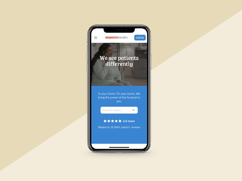
For situations where we need to show our consumer app, website or other product visuals such as our dashboard, Express, etc., please present mockups in only the most up-to-date devices. Product should be shown in clean and simple, straight on mockups and not scenic or overly skewed visuals.

Continuation in Design
When selecting imagery to pair with designs, practice good continuation in your color palette. If the imagery is in your control then use the brand palette to your advantage — match color usage through your supporting elements, typography, illustration, color blocking and patterning.
Photography Should:
- Be on a clean and organized background allowing the subject to stand alone clearly and of distracting visuals (clothing, props, brightly colored backgrounds, bystanders, etc.) that may take focus away from the main subject matter
- Use intentional cropping and framing to help the subject matter shine
- Be literal and non-subjective visual narratives that tell the story quickly
- Represent providers dressed appropriately to DispatchHealth code and demonstrate a non-intimidating, non-threatening aesthetic
- Represent diverse patient and provider ethnicities
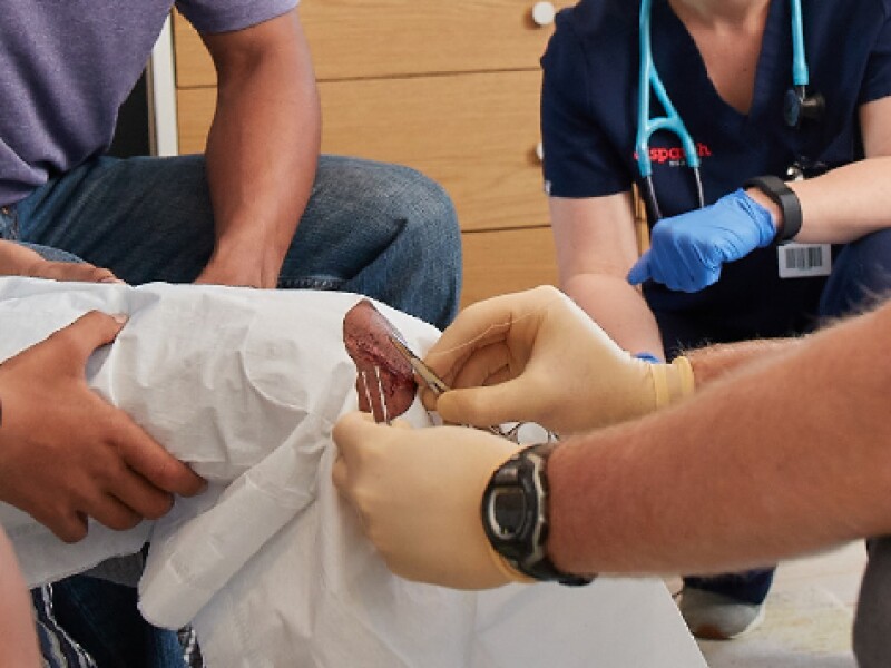
- Be free of blood or gore
Photography Should Not:
- Show treatment being performed and/or instruments that may be uncomfortable or uneasy feeling such as a needle/shot, bodily fluids, visible nausea, etc.
- Show providers with an overly edgy look, including tattoos, piercings, and personal attire
- Overly exaggerate ill patients that either aren’t genuine or feel uncomfortable
- Show dirty scenes or animals too close to treatment
- Be dated or show a dirty or worn rover vehicle
- Show kits with missing or worn branding
- Be hard to see when scaled down
- Be amateur captured (non-professional or on an iPhone)
- Be inconsistent in terms of tone, perspective, depth, and style
- Be generic, too corporate, or feel like it’s a stock image
Good Examples:


Bad Examples:

